Introduction: Pixels Look Pretty on Screen, But They Fail on Fabric
You have a killer design on your computer screen. Crisp lines. Smooth gradients. Perfect colors. You send it to your DTG printer, and what comes out on the shirt looks like a completely different animal. Edges are jagged. Small text is blurry. The whole thing has a fuzzy, second-rate feel. I have watched this happen to too many people, and the culprit is almost always the same: you started with a pixel-based image instead of a vector. That is why learning to properly Create a Vector File for DTG Printing is the single most important skill you can develop for consistently great results.
Direct-to-garment printing is amazing technology. It sprays water-based ink directly into fabric fibers, creating soft, breathable prints that last. But here is the catch that nobody tells you. Your DTG printer is not magic. It can only work with the file you give it. Feed it a low-resolution JPEG, and it will faithfully print every single pixel, complete with jagged edges and color banding. Feed it a clean vector file, and it prints sharp, smooth, professional results every time.
Let me walk you through exactly why vectors matter for DTG, how to convert your pixel artwork into vectors that actually work, and the common traps that ruin prints before they even start.
Why Vectors Crush Pixels for DTG Printing
Let me explain this without getting too technical. A raster image like a JPEG or PNG is made of tiny colored squares called pixels. Zoom in far enough, and you see a blocky grid. That grid is fine for web use, but when your DTG printer tries to interpret it, those square edges print as square edges. Your nice smooth circle becomes a clunky polygon.
A vector file uses math formulas to draw lines, curves, and shapes. No pixels. No grid. Just clean, continuous paths. When your DTG printer reads a vector, it sees smooth curves and prints smooth curves. The difference is night and day, especially on small details like text or logos.
But sharpness is only half the story. Vectors also handle color separation beautifully. DTG printers lay down ink in layers. White underbase first, then colors on top. Vector files define each color area as a distinct shape with clean edges. Raster files blur those edges, causing ink to bleed and colors to look muddy. Clean edges mean clean prints that last longer because the ink bonds properly with the fabric instead of sitting on top of a fuzzy boundary.
Step One: Assess What You Are Starting With
Before you open any software, take a hard look at your original artwork. This step saves you hours of frustration later.
If your logo or design is already a vector file (AI, EPS, SVG), you are ahead of the game. You still need to check for hidden issues like unexpanded strokes or stray points, but the heavy lifting is done.
If your artwork is a raster file (JPEG, PNG, BMP, TIFF), you have two paths forward. High-resolution images at 300 DPI or above can be auto-traced with decent results. Low-resolution images pulled from websites or social media need to be manually redrawn. There is no shortcut around garbage resolution. A 72 DPI logo from a web page will never become a clean vector, no matter how clever your software tricks.
Step Two: Choose the Right Tool for the Job
You do not need to spend a fortune on software. Here is what works at different budget levels.
Adobe Illustrator is the industry standard. It has powerful auto-trace tools and the most precise manual drawing features. At about twenty dollars a month, it is accessible for regular users.
Inkscape is completely free and surprisingly capable. Its auto-trace function handles simple logos well, and the pen tool works fine for manual tracing. The interface takes some getting used to, but you cannot beat the price.
Affinity Designer is a one-time purchase around seventy dollars. It sits between Illustrator and Inkscape in features and is a favorite among designers who hate subscription models.
Avoid using Canva or other browser-based design tools for vector creation. They export pixel-based files even when they claim to export vectors. You will think you have a vector, but your DTG printer will see a raster in disguise.
Step Three: Auto-Trace vs Manual Tracing
Auto-tracing is when your software automatically converts a raster image into vector paths. It works beautifully for simple, high-contrast images with solid colors and no gradients. Think company logos, bold illustrations, or any design with clear separation between elements.
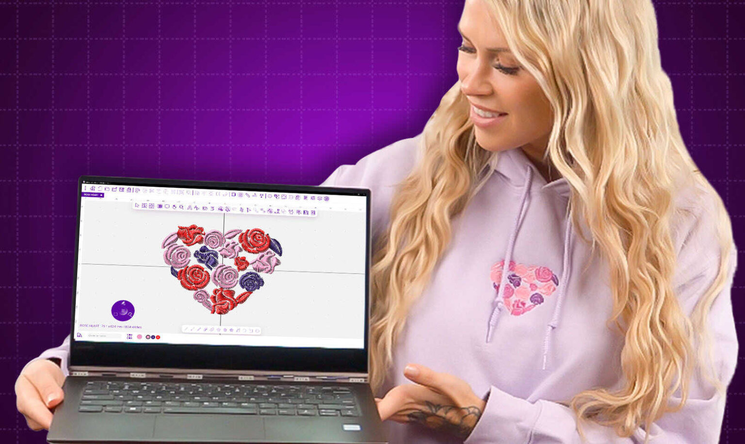
In Illustrator, use the Image Trace panel. Select High Fidelity Photo for complex images or Silhouettes for simple black and white designs. After tracing, click Expand to turn the trace into editable paths. Then clean up any messy areas with the Direct Selection tool.
Manual tracing is when you use the pen tool to draw over your image manually. It takes longer but gives you total control. Manual tracing is essential for images with gradients, soft edges, or any detail that auto-trace mangles. It is also the only reliable method for low-resolution source images.
The pen tool feels awkward at first. Click to set an anchor point. Click and drag to create a curve. Practice on simple shapes before tackling your actual logo. After twenty minutes of clicking around, it starts to feel natural.
Step Four: Clean Up Your Vector Like a Pro
Once you have your vector paths, the real work begins. A messy vector prints almost as badly as a raster file.
Remove unnecessary anchor points. Each point is a place where your DTG printer has to change direction. Too many points create jagged prints. Use the Simplify Path command or manually delete points that do not change the shape. A smooth curve needs only a handful of points.
Check for open paths. A single gap in your shape causes ink to leak out during printing. Zoom in and look for any path that does not connect back to itself. Use the Join command to close open paths.
Expand all strokes. A stroke is a line with thickness. DTG printers handle filled shapes much better than strokes. Select all your strokes and use Object > Expand to turn them into filled shapes. This also prevents stroke width from changing if your design gets resized.
Convert text to outlines. Any text in your design needs to become vector shapes. In Illustrator, select the text and hit Shift plus Control plus O on Windows or Shift plus Command plus O on Mac. This ensures your fonts do not get substituted or distorted by the print shop software.
Step Five: Set Up Your Colors Correctly
DTG printers use CMYK color mode, not RGB. CMYK stands for cyan, magenta, yellow, and black. RGB screens display bright colors that CMYK inks cannot reproduce.
Before you save your vector, switch your document color mode to CMYK. Any neon greens or electric blues will look different when printed. Adjust your colors until they look right on screen, then order a sample print to see the real results.
For dark garments, you need a white underbase layer. Some DTG printers handle this automatically, but you can force better results by creating a separate white layer in your vector. Duplicate your design, fill it with white, and place it underneath your color layer. Name the layer WhiteUnderbase clearly so the print operator knows what you want.
Step Six: Save and Export the Right Way
Never send a native AI file to a print shop unless they specifically ask for it. The universal champion for DTG vectors is PDF with editable layers.
Go to File > Save As > PDF. Check the box that says Preserve Illustrator Editing Capabilities. This keeps your vector data intact while making the file readable by almost any print shop software.
If your print shop prefers another format, high-resolution SVG or EPS are good alternatives. Avoid PNG or JPG entirely. Those formats flatten your vector back into pixels, destroying all the work you just did.
Name your file clearly. Include your name, the design name, and the color count. For example, YourName_LogoDesign_4Colors.pdf. Print shops appreciate this more than you know.
Common DTG Vector Mistakes That Ruin Prints
Let me save you from the errors I see over and over.
Tiny details that disappear. Any element smaller than 1.5 millimeters should be removed or enlarged. DTG printers have physical limitations. That delicate 1mm line will print broken or not at all.
White ink set to knockout instead of spot color. When you use white as a color on a dark shirt, you need to tell the printer to actually print white ink. Setting white to knockout means the printer leaves those areas blank, showing the shirt color instead.
Transparency effects like drop shadows or glows. DTG printers do not handle transparency well. Expand and flatten all transparency before saving. A drop shadow should become a separate solid shape at reduced opacity, not a live effect.
Missing bleed area. Your design needs to extend about 3 millimeters past the cut line. Without bleed, any slight misalignment during cutting leaves a white edge. Create a bleed by enlarging your background shapes beyond the artboard.
Conclusion: Vectors Turn Good Designs Into Great Prints
You started with pixels on a screen. You ended with a clean, sharp vector file ready for your DTG printer. That journey is not always fast, but it is always worth it.
A proper vector file gives you sharp edges that do not bleed. Clean color separations that print accurately. Scalable artwork that looks the same on a hat as it does on a hoodie. And most importantly, prints that last because the ink bonds properly with the fabric instead of sitting on top of a fuzzy, pixelated mess.
So take an extra thirty minutes on your next design. Open your vector software. Trace those paths. Clean those anchor points. Expand those strokes. Your DTG printer will thank you with prints that look professional, feel soft, and survive wash after wash. That is the difference between a file that just prints and a file that actually works.